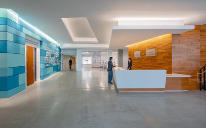
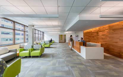
University of California, San Francisco - Wayne and Gladys Valley Center for Vision
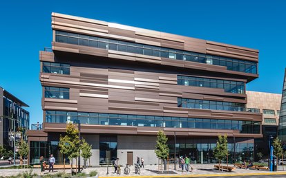
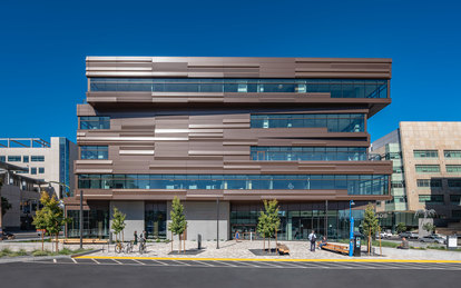
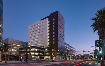
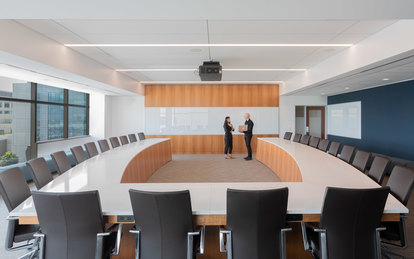
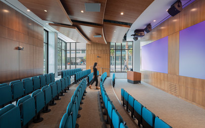
A neuroscience vision research center and administrative tower come together in a striking design that establishes a new gateway to UCSF’s Mission Bay East Campus. Interiors address the unique needs of its patients as the structure thoughtfully addresses seismic and site considerations.
客户
University of California, San Francisco
位置
San Francisco, California
市场/服务
Academic Medicine, Architecture, Commercial Office Buildings, Health, Interiors, Lab Planning, Medical Planning, Sustainable Design, Corporate & Commercial
大小
360,000 GSF
Renowned for its Department of Ophthalmology, the University of California San Francisco (UCSF) sought to unite its vision programs under one roof, bringing together faculty, researchers and clinician-scientists who provide leading patient care. It selected a site adjacent to the existing Mission Bay campus, a resurgent area busy with pedestrian activity and adjacent to the new Chase Center, home to the National Basketball Association’s Golden State Warriors.
The Valley Center for Vision responds beautifully to this range of users, needs and neighbors. The building design is inspired by its dual functionality and the duality of its site, which transitions between the institutional scale of the UCSF medical buildings to the west and the Chase Center to the north and the more traditional residential scale of the Dogpatch neighborhood to the south.
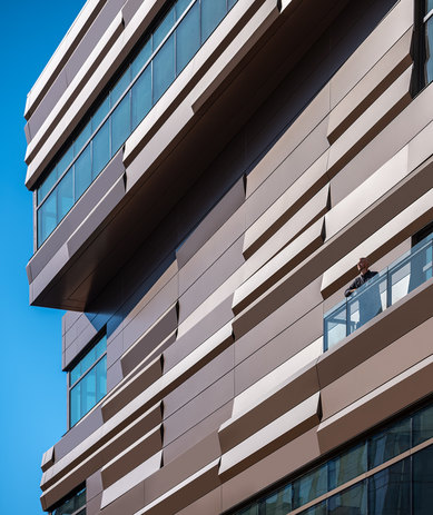
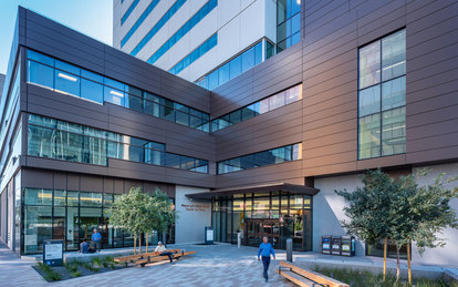
It consists of a five-story clinic and a 12-story administrative tower, each with differing material palettes and fenestration, resting on a shared base.
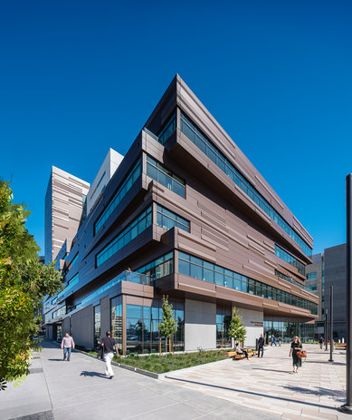
The five-story clinic welcomes the public into a space designed for universal accessibility. Clad in textured bronze panels, its appearance changes with light and shadow, honoring the nuances of vision.
It houses specialty care suites for complex eye conditions, outpatient surgical suites for cataract, LASIK and other procedures, and a ground-floor dedicated to high-value procedures. The third and fourth levels are dedicated to clinics for vision care of all types, including treatment for specialty conditions. The clinic also is home to the Francis I. Proctor Foundation, dedicated to research and training in ocular diseases and to eradicating blindness throughout the world. Its facilities include a research lab and simulation lab where students can learn procedures and practice eye surgery.
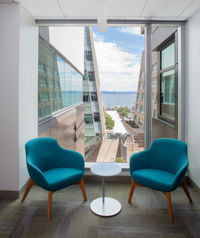
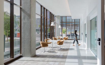
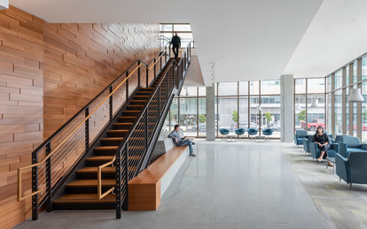
Interior design strategies help those with visual impairments recognize and navigate the building. Differing textures and contrasting colors assist patients in orienting themselves while adding warmth to the interiors.
Hallways, for example, are painted gray on one side and a bold, saturated color on the other. Light is used as a wayfinding element, as well, with a window placed at the end of nearly every corridor. Textures and colors also vary by floor, adding more distinct reference points throughout the building. Overall, the interior achieves the client’s goal of feeling comfortable rather than clinical.
Ample data was gathered to gain better than code seismic performance which was designed based on output assessment of non-linear time history modeling. The team used 3D laser scanning to perform quality control on structural elements of the intriguing technical solution, which involved a massive mat slab tied town with seismic anchors.
